Healthfirst redesigns tabloid-style pub into sleek magazine
The company’s new quarterly magazine is eye-appealing and filled with content employees want to read.
It takes more than a new color palette and layout for a publication to be recognized for Best Redesign (Print or Electronic) in Ragan’s 2012 Employee Communications Awards.
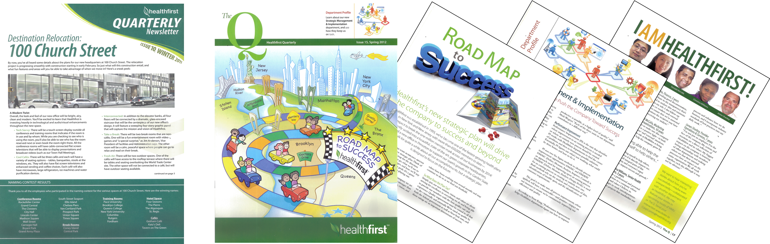
The new design must be purposeful and the content should be superior, culminating in a publication that employees want to pick up and read. Team members at Healthfirst accomplished just that when they redesigned its quarterly tabloid-style print publication into what’s now called The Q. They are the winners of the Best Redesign category in this year’s Employee Communications Awards.
Here’s a snapshot of what they did:
- Content: The former Healthfirst Quarterly Newsletter talked at employees, not to them. The new publication, now called The Q, connects with staff much better. From the type of stories to a consistent Table of Contents in each issue, the publication is no longer “corporate stuff.”
- Design: The format was changed from a newspaper tabloid to a magazine format. The design is much livelier, colorful, and eye-appealing. Coupled with a heavier stock of paper, the new look is a 180-degree improvement.
- Results: Employee survey results reveal a tenfold increase in employee-generated comments and requests for additional copies of The Q.
We congratulate the team members who collaborated on the winning effort.
Want to get recognized for your hard work? Find out about Ragan and PR Daily’s award programs here: http://www.ragan.com/Awards/RaganAwardsPrograms.aspx
View More Employee Communications Awards 2012 Winners.
Visit Ragan.com/Awards to learn more about awards opportunities.