St. Jude documents a year with images of hope
In its annual report, the iconic children’s research hospital combines young faces with accessible information about its successes in treating patients and mitigating the scourge of cancer.
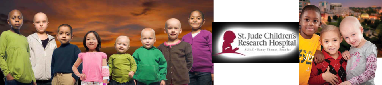
Hope.
It’s there in the young faces. It’s there in the two-page graphic about the rise in five-year cancer survival rates. It pervades every page.
In its annual report, St. Jude Children’s Research Hospital encapsulates a year and sets the stage for abundant tomorrows—tomorrows that too many kids might not have seen without its efforts.
That report wins Ragan’s 2013 Employee Communications Award for Most Improved Design (Print).
Because all of St. Jude’s treatments and research are funded through donations, appealing to potential donors is of paramount importance. The editorial team achieved its objective of eschewing its prior text-heavy format in favor of delivering information in a far more palatable way.
The stories are told in bright eyes and stark yet encouraging numbers. The presentation combines quotes and factoids, successes and developments.
The quotes come from doctors and administrators and, most important, from grateful parents whose children received treatment and a new start because of St. Jude.
Photos of young patients complement accessible infographics and bullet points that fill the report.
Special congratulations go out to Amanda Robbins, Amber Mannering, Jerry Harris, and Tara Milligan for their exceptional work.
Want to get recognized for your hard work? Find out about Ragan and PR Daily’s award programs here: http://www.ragan.com/Awards/RaganAwardsPrograms.aspx
View More Employee Communications Awards 2013 Winners.
Visit Ragan.com/Awards to learn more about awards opportunities.
