Building accessible communication habits that stick
What if accessibility were baked into your process from the moment you started brainstorming?
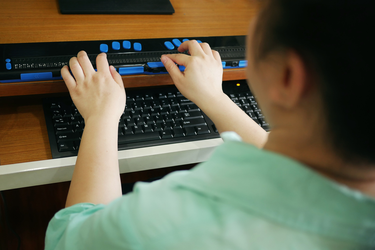
Matisse Hamel-Nelis is a consultant.
Digital accessibility in communications starts with a simple shift in perspective. What do I mean by that? Well, instead of asking “How can people access my message?” ask “How many ways can people access my message?” The difference between these questions is the difference between accommodation and innovation. When you create multiple pathways to the same information, you’re not just helping people with disabilities. You’re building resilience into your communication that makes it work better in more situations for more people.
Here’s what I see happening all the time. A communicator will spend weeks crafting the perfect campaign, writing copy, designing visuals and getting everything just right. Then, at the very end, someone asks, “Oh, is this accessible?” And suddenly they’re scrambling to retrofit accessibility into something that wasn’t designed for it from the start.
But what if we flipped that? What if accessibility were baked into your process from the moment you started brainstorming?
Now, before you start feeling overwhelmed, let me be clear about something. This isn’t about becoming perfect at accessibility overnight. It’s about progress, not perfection. And here’s the thing I really want you to understand: practice makes permanent.
Every single day, you’re practising something. When you post that Instagram photo without alt text, you’re practising exclusion. When you choose colours for your presentation without checking if they work for people with colour vision differences, you’re practising inaccessibility. When you create a PDF by just hitting “export” without thinking about how a screen reader will navigate it, you’re reinforcing habits that leave people out.
But here’s the flip side, and this is where it gets exciting. Every time you add a thoughtful image description, you’re practising inclusion. Every time you organize your document with proper headings, you’re building accessible habits. Every time you choose clear language over jargon, you’re creating communication that works for everyone.
I learned this lesson the hard way when I first started on my accessibility journey. I had been preparing a presentation for a client meeting, which I’d spent hours on the design, making these beautiful slides with colour-coded information and clever visual metaphors. I was pretty proud of it, honestly.
Then I decided to test it with a screen reader, just to see what would happen. It was a disaster. My carefully organized bullet points made no sense when read aloud. My colour-coded charts conveyed zero information to someone who couldn’t see the colours. My visual metaphors were just confusing noise.
That moment changed everything for me. I realized I’d been designing communication that only worked for people exactly like me. And, let’s be real here, that’s not what communication is about.
So, I deleted what I had and started fresh. This time, I really thought about how I laid out the information. I also made the content more descriptive, used headings for navigation instead of just decoration, and you know what? My result was still creative and easy on the eyes, but it was also way more effective in getting my message across.
The best part? The tools for accessible communication are already built into most of what you use every day. Your email platform has alt text fields. Your word processor has accessibility checkers. Social media platforms prompt you to add image descriptions. The infrastructure is there. We just need to get in the habit of using it.
Start small. Really small. If you post images on social media, start writing descriptions for them. Not just “photo of a sunset,” but something useful like “orange and pink sunset behind city skyline with office buildings silhouetted against the sky.” Takes 30 seconds. Makes a huge difference for someone using a screen reader.
If you’re creating presentations, use the actual slide title field instead of just making text bigger and bolder. If you’re writing documents, use real headings instead of just formatting text to look like headings. These structural elements are invisible to sighted users, but they’re navigation landmarks for people using assistive technology.
I know some of you are thinking about the business case right now. And yes, it’s solid. You’re expanding your potential audience. You’re reducing legal risk. You’re often improving the user experience for everyone. But honestly? The business case isn’t why I care about this.
I care because people deserve to access the information you’re sharing. When you post a job opening that screen readers can’t navigate, you might be excluding the perfect candidate or a large pool of potential candidates. When you share emergency information in an inaccessible format, you could be putting someone at risk. When your marketing materials only work for people without disabilities, you’re essentially telling everyone else they don’t matter to your organization.
Learn one new thing each month. Test your content with accessibility tools. If you know people with disabilities, ask them about their experiences with digital communication. Pay attention to how accessibility features work in the tools you already use.
Maybe it’s writing alt text for the images in your next social media post. Maybe it’s checking the colour contrast in your presentation. Maybe it’s using proper headings in your next document. Whatever you choose, do it consistently until it becomes automatic.
Your audience includes people with disabilities, whether you’re designing for them or not. The question is whether you’re going to acknowledge that and communicate accordingly.
This isn’t about perfection. It’s about progress. And progress happens one practice at a time. Every accessible email you send, every inclusive presentation you create, and every clear document you write is making inclusion more permanent in your work.
And that matters more than you might think.